Thursday, September 8, 2011

The untouchable entering architecture


Greg Tran from the Harvard Graduate School of design made a fascinating video for his thesis work. It shows how a virtual world could be placed over the physical world, making for example the interior of a building vary in appearance depending on the person entering (visitor, student, or staff member) or the time of day (visual blocks for areas so people can work). The vision he shows is based on a  3D virtual reality that can be manipulated 3D and thus goes beyond watching in your chair with a weird set of glasses on.


Thinking through how this would work does make it clear that it remains the adult version of an imaginary play. If you do not want to play along you take out the lenses that are used to project the images in your eyes and you can walk through walls perceived by the ones still into the virtual reality. Just as in school playgrounds such party crash behavior will probably not be appreciated, and not before long there will be rules and sanctions on those not willing to play along.

Another issue is how the other senses will be involved (or confused). People are a very visual type of breed but we still listen, smell and touch. Projecting a visual barrier to create privacy does not stop sound, so sharing dirty secrets in a virtually separated area might not be the greatest idea. And  you may project something appearing to be paradise, but if you do so on a rubbish dump you would still smell reality. So virtual 3D would not change reality but add another fascinating layer to it.

Saturday, August 27, 2011

Designing the untouchable

Design literally shapes our day to day life. All objects we use have been designed in the near or distant past. With the virtual world becoming more intertwined in daily life, scope for designers increases as well. In the absence of physical requirements the range of possibilities increases – as does the room for spiraling frustration since you cannot kick a program that does not work. Not that kicking  generally fixes a unwilling object, but it does feel good.

The untouchable character of the virtual world has real life implications. Separating from a stack of cash just does hurt more than swiping a small plastic card and typing a random number. It seems that our loss aversion, which creates all kinds of seeming irrational behavior in the real world, is at loss in the virtual one.
 
A project by  Jaap de Vries address this issue by designing an app that visualizes your finances – giving shape both the changes in the amount of money you have as well as to the virtual money itself. The idea of his project is that virtual money is not designed, in contrast to coins and notes which are always a treat when you are travelling (although with the euro you need to travel a lot further to enjoy this part of being on the road). Inspiring idea on shaping the untouchable, since architecture is all about designing emptiness. After all, people live and experience the space left by architects.

Friday, August 26, 2011

Iconic mushroom


At time designs make you feel lost, not from excess of space but from excess design. Visiting the Metropol Parasol   in Seville felt like being on a trip, and not being sure it was a good one. The design by J. Mayer H. Architects is impressive in terms of size and fascinating to look at with all the curves and squares. It makes for great architectural photographs. That is, if you manage to keep its surroundings out of the picture. The absence of any relationship with the surrounding buildings and not very subtle shape makes it scream ‘I am the new icon of Seville’. 

Although it is one of the largest bonded wood constructions in the world this is completely hidden by a polyurethane coating. No doubt increasing the durability but at the cost of the friendliness of the imposing structure. 

Being just recently opened it already became a focal point of the city. The large stairs proved to be the perfect stage for the recent demonstrations. A literal stage, with escalators next to the stair full of protestors allowing bystanders to stand still and stare while moving up and down. Architecture turning reality into some sort of huge TV show.

Thursday, May 5, 2011

Lost in space

The VM housing and Moutain dwellings are part of a for Denmark unprecedented plan of expansion, Ørestad South. Meadows are to be converted in a commercial and residential area with the size of an average provincial town. 

Le Corbusier - Ville Radieus
Lessons have clearly been learned from past modernist ideas about designing new cities. Functions (living, work and leisure) are mixed and not separated. And most notably the apartment buildings have distinct characters, no assumption that a single design will fit all.  

When I walked around the area without any knowledge of the design concepts, however, it reminded me of the Bijlmer. The large green areas between the high rises felt pleasant on the sunny day I was there. But with the Bijlmer in mind I wondered if they really will develop into commonly owned areas for all to use. 

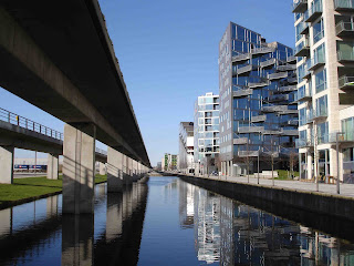
Walking back towards the metro it seemed I walked into an image from Le Corbusier. The metro (which is completely computer–driven) is high up and main access roads are right next to it, all set in plenty of space. Lacking any trees to demarcate the pedestrian areas I felt lost in space. 

 For me it illustrated the difficulty of creating a public space from scratch and reminded me of a hilarious rant on public space failure in the United States by James H. Kunstler. 


It does make you wonder how we can create cities and public spaces worth caring for through architecture? What can we learn from the past and what can we learn from other parts of the world in the present? After all, the largest cities today and in the future are not in Europe nor the United States, but in Asia, South America and Africa.

Sunday, May 1, 2011

Defining balconies?


Next to the Mountain dwellings is an earlier building of Bjarke Ingles, VM housing. Although I also knew this building from photographs, I did not realize I was right next to it. The quintessential picture of this building is from the balcony side and I came from the other side.

According to a podcast from the Danish Architecture Center the balconies do remind some of the (in)famous Titanic movie scene. The outward orientation of the balconies contrasts with the more standard sideways orientation of balconies and is intended to increase contact between the people living in the apartments. 
 
Also contrasting with standard apartment buildings are the 100 different types of apartments to cater to a mix of people and livestyles. The modernist idea that there is one ultimate architectural solution suited for all people whatever their background or family situation has been abandoned. Other features that seem to aim at fostering a sense of community are a big fireplace and play areas next  to the building. The architecture signals that lessons have been learned from the modernist anonymous apartment blocks build in the sixties and seventies.
  
The shape of VM balconies prevent separations between neighbors which you find in standard apartment buildings. However, standing under the balconies made me curious about the psychological effect of the spatial organization of the balconies. There is a reason why we say we look up to someone we respect -  our biological wiring makes us associate being physically on top with social dominance. 

It made me wonder if people on the lower balconies feel the others look down on them in a psychological sense as well. Would be interesting to research if the balconies not only define the picture of the building in architecture magazines, but also the social interactions among its inhabitants.

Architect: BIG (Bjarke Ingels Group)  |  Completion: 2005  |  Location: Copenhagen.

Wednesday, April 27, 2011

Into the Danish mountains

Getting off the metro the mountains cannot be missed. Like proper mountains do, the building offers a clear landmark. Nice if you live there and never have to explain to your friends which of a series of anonymous building block they need to go. 


When you get close and no longer experience the mountain image, the holes with which it is created change the reflection of the face of the building. On a sunny day the building then seems to be covered by patches of clouds. 

And even on the inside it works great, maintaining the connection with the outside. On a sunny day you get a wonderful negative of the image you see on the outside. And for Adolf Loos adepts, the wall is not just decoration. Through the holes it provides natural ventilation for the car park.


Once inside the car park you can easily find your way to the apartments. The color coding of the floors shows right away where the car park stops and the housing starts. And the colors will help visitors with a lack of number-memory (like me) to find the right floor.


Walking around and through the building it changes face. There is the very present mountain walls, on the inside balanced by the colorful levels of the housing parts. When you walk around to the lower part the slope of penthouses with wood sides suddenly opens up. Each apartment has a large sun-facing terrace and it looked like in summer the whole slope will be green. 


Must be a great experience coming home from the city, see your mountain from far away, pass through the color-blasting corridors and enter your apartment with an unobstructed view past a terrace of wooden panels and plants.


All in all I found the mountain dwellings better than in the polished pictures. The whole building felt balanced and with a lot of attention for detail. The image at the entry of the car park of the deer on a stack of cars summarizes the building for me: cars provide the basis for a place to live in sync with our natural needs.


Architect: BIG (Bjarke Ingels Group)  |  Completion: June 2008  |  Location: Copenhagen.

Saturday, April 23, 2011

Architectural alchemy

An important reason for taking the opportunity to head to Copenhagen is a 2009 TED talk by Bjarke Ingels. When watching this talk for the first time I had made all practical arrangements to switch career and was in the middle of one of those  “what the “#$^&*@ have I done – this will never work out” episodes. 


This TED talk showed me there were people with similar ideas out there already walking the walk. The bit on the Mountain dwellings really resonated with me: a building designed to optimize the living experience of all its inhabitants (and the views from the neighboring building where Ingels lived himself at the time), considering environmental issue, economically feasible and architecturally interesting. Inspiring and motivating me to keep going down my new career path.
 

Image: Installation of Steen Hoyer, DAC, Copenhagen April 2011